Embracing the Square and Vertical: My Unique Journey in Street Photography
As a photographer for more than six decades, my view of the world through the lens has become not just a habit, but an instinct. One that, as peculiar as it may sound, rejects the landscape format. While others embrace the wide, sprawling beauty of landscapes, I’ve always gravitated towards squares and verticals. This choice isn’t arbitrary—it’s rooted in the way I’ve learned to see and frame the world, a habit formed early on when I began my journey with a Yashica 635.
I can still recall the excitement of purchasing that first camera. I had my sights set on the illustrious Rolleiflex, but the price tag was out of reach. So, I settled on the Yashica 635, a camera that came with its own charm and set me on the path of composing square images. That square format became my guide, shaping my approach to photography and making the 1:1 ratio feel like home. Decades later, even as technology evolved and cameras offered all manner of formats and aspect ratios, that square stayed with me, defining the way I captured life.
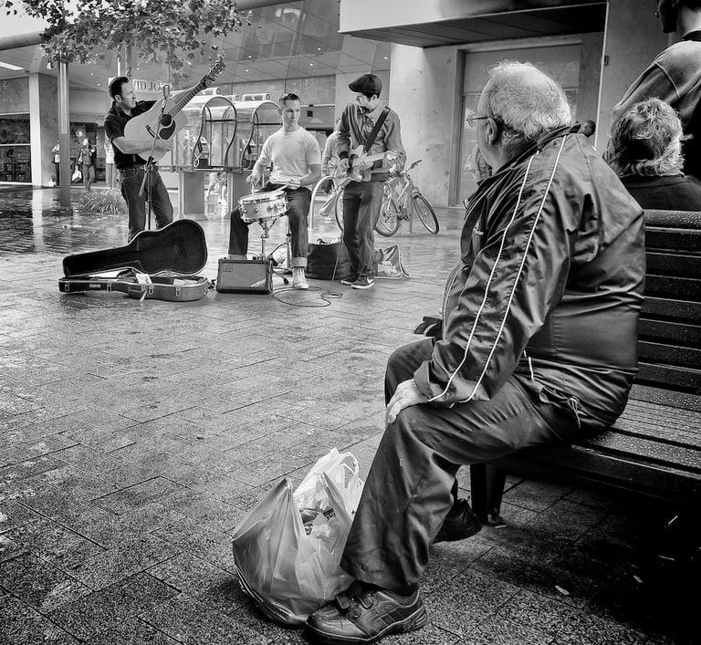
The Pull of the Square Format
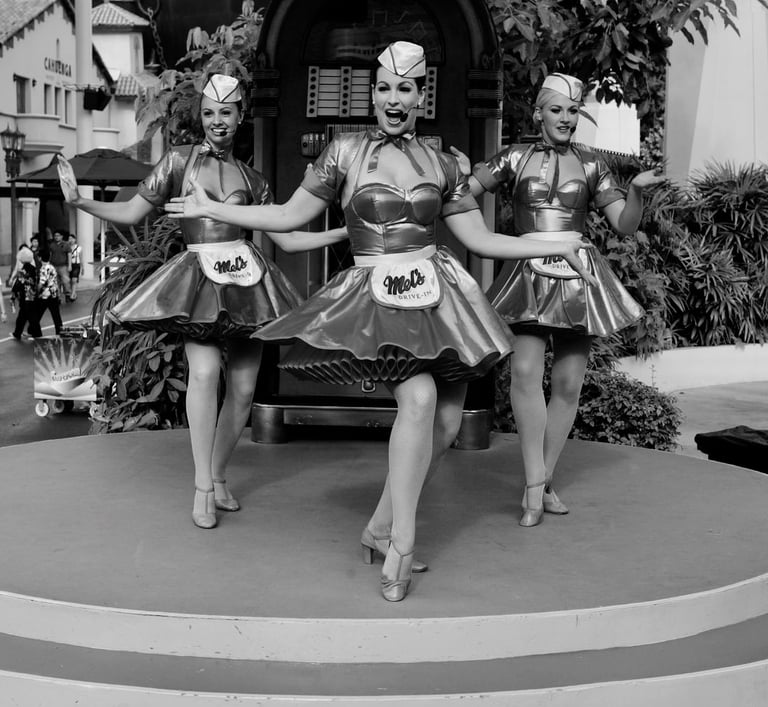
The square format appeals to me because of its symmetry and the discipline it demands. There’s something precise about a square—it forces you to think carefully about every element within the frame. With no extra space to waste, every line, shadow, and subject must have a purpose. The square format doesn’t allow for sloppiness, and that’s why I love it. Each composition becomes a puzzle of balance and harmony, and over the years, I’ve learned how to solve that puzzle intuitively.
This attachment to the square format became second nature as I transitioned from one camera to the next, continuing to work within those clean, equal borders. Even when I began to experiment with other formats, I found myself returning to the square. It just felt right.
Finding My Way with Vertical Compositions
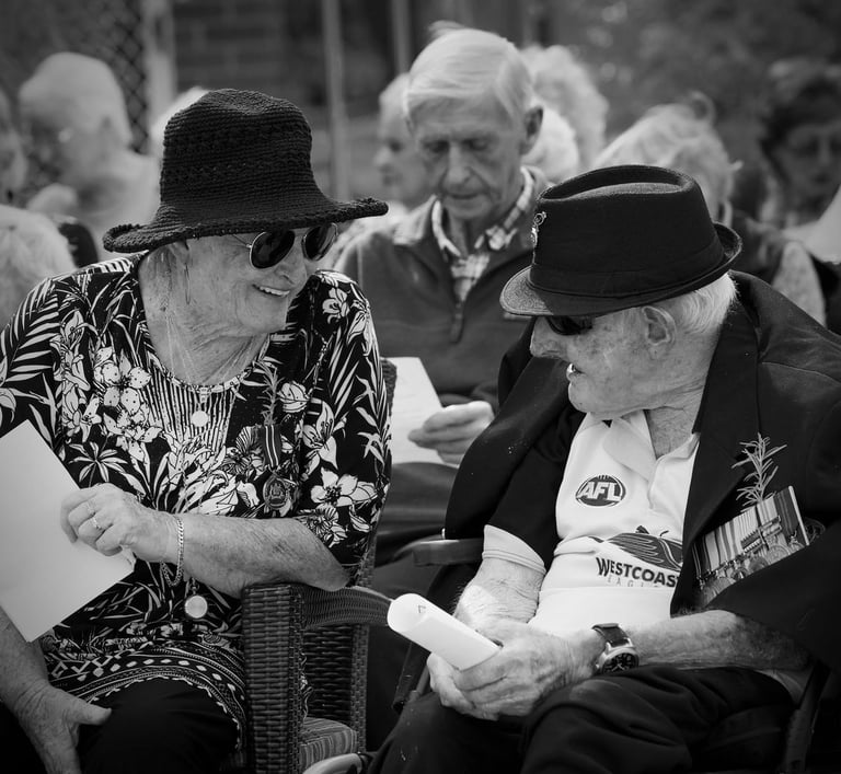
As my work evolved, particularly in portraiture, the vertical format became another natural extension of my style. There’s something about the vertical orientation that lends itself perfectly to capturing the human form. It accentuates the natural proportions of the body, drawing the eye upward and creating a sense of elegance and focus. Whether I’m photographing a person standing tall in an alleyway or framing a figure against the backdrop of urban architecture, the vertical format just feels more intimate.
Portraits, after all, are about people. The vertical format mirrors that focus on the individual, allowing me to zero in on facial expressions, gestures, and other details that convey emotion and personality. It’s like the frame becomes a window into that person’s world, and I’ve found that this orientation helps tell their story better than a wide, horizontal view ever could.
The Landscape Conundrum: When It Feels Wrong
Then there’s the landscape format. For many photographers, it’s the natural choice for capturing wide scenes and big environments. But for me? Landscapes have always felt… wrong. Not wrong in the sense that they aren’t beautiful—there’s certainly a time and place for those sweeping vistas. But when I look through the lens or browse through my archives, I find that landscape-oriented shots are visually disruptive, like an unwelcome guest at the table.
The truth is, I can’t help but cringe when I see landscape images mixed in with my squares and verticals. It’s as though those landscape shots are screaming at me for help, begging to be realigned with my visual sensibilities. To see them alongside the rest of my work is almost offensive to my eye. They break the flow, disrupting the clean, orderly world I’ve built within my body of work.
It’s as if every landscape shot is a reminder that, while technically correct, it doesn’t belong in the visual language I’ve spent decades refining. When I pull up a screen full of thumbnail images—years of photographs captured in moments of raw emotion, light, and shadow—it’s the landscapes that stand out like sore thumbs. They mar the visual harmony, leaving me wondering why I ever took them in the first place.
A Reflection of My Vision
Perhaps this peculiarity is simply a reflection of my personal vision. For me, photography has always been about distilling the world down to its essence—capturing those moments that are fleeting, intimate, and deeply human. The square and vertical formats lend themselves to that kind of focus. They allow me to hone in on what truly matters, whether it’s a face in the crowd or the shadow cast by a streetlamp at dusk.
The landscape format, on the other hand, feels too wide, too open. It invites the eye to wander aimlessly, rather than guiding it with intention. That’s not to say I’ve never taken a landscape shot that I’m proud of—but those moments are rare, and usually when I’m deliberately trying to break away from my usual style for the sake of experimentation.
Even then, I’m often tempted to leave ample white space around the image, using the extra room as a framing device to isolate the subject. It’s a technique I’ve used occasionally when I want to create a sense of diversion or separation from the usual aesthetic, but even then, it’s a conscious choice to bend the rules.
The Artistic Struggle
I suppose this peculiarity could be seen as a limitation, but to me, it’s simply the way I’ve learned to see the world. We all have our quirks, and this happens to be mine. There’s an artistic struggle in trying to fit the world into a box—literally, in my case—but I’ve come to embrace that struggle as part of my creative process.
Photography, for me, isn’t about capturing everything. It’s about distilling the world down to those moments that matter, and for whatever reason, I find those moments easier to capture in square and vertical frames. The clean lines, the symmetry, the focus—they all resonate with me in a way that landscapes never could.
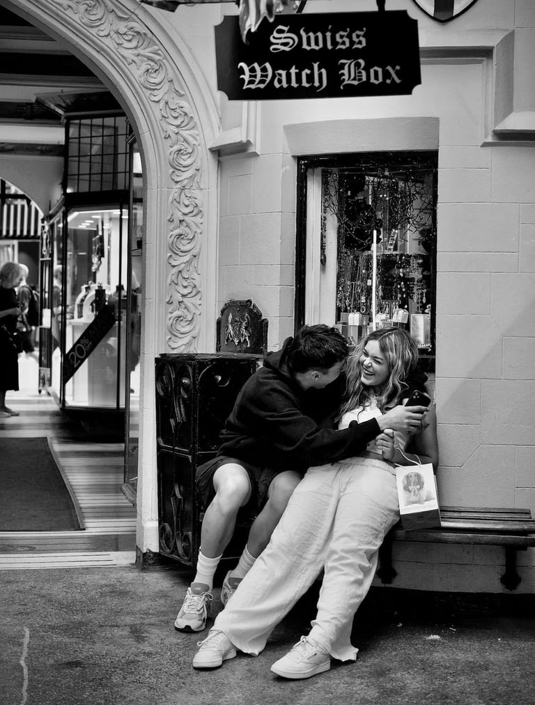
Conclusion: Embracing My Quirk
In the end, this "peculiarity" is less of an oddity and more of an artistic bent. It’s the way I’ve chosen to see the world, and it’s the format that feels most natural to me. Whether I’m capturing a candid moment on the street or framing a portrait in the studio, I trust my instinct to guide me towards the compositions that feel right—square or vertical.
And if the occasional landscape finds its way into my work, well, maybe it’s just a reminder that even the most seasoned photographers need to step outside their comfort zones from time to time. But rest assured, I’ll always return to the formats that have shaped my vision, the ones that feel like home. For me, that’s where the magic happens.
Copyright © 2025 Peter Pickering. All Rights Reserved. All Wrongs Reversed.
🌐 peterpickering.com | 🎺 sessionsonthegreen.com | 💜 isaacbcole.com | ▶️ YouTube Channel


